Fan Submission
First and foremost it was made with one of the fancier brushes in the modern MS Paint (Though I think this version is also defunct now in favor of Paint 3D), grease pen I believe, so it lacks precision. The chicken's feathers have a texture, which is nice but it's entirely the wrong texture. It's better to just leave it flat.
This piece is rather large, but didn't add much with all the extra canvas. The shading on the comb and waddle is nice, but the background is visible through, as the dark part wasn't drawn over the edge, but around the main portion.
Overall, a decent chicken and a solid first attempt. The fill on the body isn't complete, with the background visible through the colors. Most importantly it was not saved as a jpeg. This is the most important thing as it is the biggest problem I've seen with what people have sent me in the past.
Shades McCoolguy Fan Art
Link to this image on Karisean's DeviantArt
Filled Fan Character Sheet
Now onto the key point. This is just some bad art. Those blank eyes are slightly disorienting. I just feels wide. I don't like the way the beak looks... I like clearer divisions between things. Not sure what I don't like about the comb. Well look, I'm more happy that fan art than I am upset about bad art. I feel like I'm letting you all down by not tearing it apart though... :-(
These Potential Chickens Died On Your Farmer's Face Last night by MercuryCrest
Sorry, couldn't resist the tagline.
I haven't used MS Paint in 15 years, but this blog has inspired me.
The attached is my version of "SuperChicken"...mainly because I eat them constantly....
Yes. eggs are indeed potential chickens. interesting use of colors, though it is rather inconsistent. I mean brown is the outline of the white, but black is the outline of the yellow. Of course you saved it in Bitmap which is lossless(which is good) but bad for the internet(which is why I resaved it in PNG) Also this picture was pointlessly large in resolution and surrounded by more white space than I like to see.
No real problems with it, though I don't care for large single pixel outlines.
April Fools: New System
![]() |
Add caption |
![]() |
Fan Chicken #1 by Beth Harvey |
![]() |
Chicken Knight by Briones |
![]() |
WHO CAN FACE HIM by Briones |
![]() |
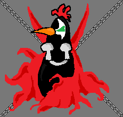
Still Life by Briones |
![]() |
Fin by Chicken Maker Kaloo |
Avion Affection
And I like the pixelated heart. That is all
Scoot
Yeah. Another guest chicken. This one from MozerSmozer who sill needs a website so I have something to link to. Also you're just getting a chat log.
9:40 PM - MozerSmozer: http://img838.imageshack.us/i/scoutchicken.png/
9:41 PM - Kaloo: What did you do boy...
9:41 PM - MozerSmozer: ees Scout Chicken
9:41 PM - Kaloo: Why didn't you disable the antialiasing?
9:42 PM - MozerSmozer: wait what?
9:42 PM - MozerSmozer: I did no such thing
9:42 PM - Kaloo: So you claim you did disable it?
9:42 PM - MozerSmozer: new MS Paint just sucks
9:42 PM - Kaloo: Yeah, you gotta disable the antialiasing
9:43 PM - Kaloo: But I'll take the simple fact of new MS paint suck into account while I mock your absurd lack of wattle
9:44 PM - MozerSmozer: I'm not a wattle man I guess
9:44 PM - MozerSmozer: didn't do it on the other on etheir
9:45 PM - Kaloo: that's true enough.
So yeah. Team Fortress 2
Striking Body
-Beth Harvey
Thanks for making an effort. It didn't come out badly at all. Always nice to hear back from you people. Well. It's quite acceptable, but it still isn't good enough. I just can't even visualize the right answer to this body.
Punk Chicken
Oh, and I had one question as well. Do you have any tips you can give me, as a new blogger, on how to get my website seen by people. I've created a facebook fan site and have attempted to share it through friends, and friends of the friends and so on. How do did you get yours to be as popular as it is?
Many thanks Louie Neale of The Third Side Story ( http://3rdsidestory.blogspot.com/ ) :)
Okay. I got a fan chicken a while ago but I forgot to post it up, so here we go!
My issues with this chicken are as follows: Firstly. The image is WAY too big. It makes it hard to get a grasp of the whole picture. The wattle is a bit too off the face and attached to the beak rather than the face.(An easy mistake to make) The body is too large and doesn't peak off sharply enough.
But well.... you got passion Louie. And I can hardly expect someone's first attempt to be aces.
And as far as a punk chicken. I hadn't... though I did make a couple chicken punks.
As for advice. Facebook's lame. I almost never told a soul I knew about the site and almost all my traffic comes from the link posted on the extremely popular Hyperbole and a Half, which you should stop being one of the 10-bajillion rip-offs of. Though I suppose it would be more fitting to say that Hyperbole launched a whole genre of blogs, but regardless you'll never stand out unless you do it on your own. Which based on your latest turtle drawing... I don't know where I'm going with all of this. I have no idea how Allie found my site to begin with... I started to ramble about things...
My advice is to make a niche for yourself. There ain't nothin' like this site! And that is the only reason that I garner any interest at all. Also being totally awesome.
A Fan Made Robot
Seeing as how I’ve been both very bored and broke for the past week or so, I’ve been spending loads of time on the internets.
I found your blog a couple weeks ago and have been checking in every couple days to see what’s new.. I really appreciate your work.
So much so that I was inspired to create something of my own. Mind you, it has nothing to do with chickens, but like I said, I’m bored and broke, so I need cheap entertainment. This is my first real attempt at MS art..
I guess I’m just sending this because it was inspired by your chicken rainbow and nobody’s around right now for me to show it to.
His coat kinda came out pixilated.. I think that’s just because I was using fine lines. I wanted to put a flower on his lapel, but I’m not at that level yet. My idea for him was a timid kind of robot butler, or perhaps waiter at a classy establishment. Hmmm.. Anyways, enjoy!
Regards,
Mike

First things first. Mike saved his robot butler as a BMP, which is good(unlike jpeg) but not web friendly. It's best to save as a PNG. As for the coat. There's nothing wrong with a bit of pixelation, but since you used gray for the outlines you probably should have colored the whole coat black(maybe with a red tie). I'm supportive of the fact that he had a simple idea behind him. He's a classy robot servant. It's a good base. I must say his slightly crooked grin makes him look a bit evil though. I actually rather like the floatation rings. Your biggest problem is the tophat.You have the band placed midway up but that goes at the brim, like so.(Sorry. that's rather abstract looking. This earlier rather terrible one may be better)
At any rate your robot looks about on the level of this robot. And I rather like ole batwings there.
Sorry about the lack of chicken this post. I'll have another up later today
The Moze Knows
I was a fan of Spawn so I can really appreciate this one. I can also say I wish those eyes were more glow-y.
Briones Sucks Now
"hold the line!" by Briones
Fan Work by Briones
I wanna see more like this. It sets a new standard!
Guest Chicken, from Cory Marinecz
This is the first time I've gotten any 'fan' work so I suppose I should be flattered but it's so awful that I can't bring myself to it. Included with the image was the following quote "This is a sad chicken with a top hat and an identity crisis. :(" And being as this is a first I've decided to crush it with a 5 paragraph essay! The problems are the lack of structure, the contrasting colors and the lack of passion by the artist.
The structure is a complete mess. The porportions are terrible. The feet are poorly structured. However the artist's lack of technical efficiency can be forgiven by his inexperience in the field. Despite this some attributes are simply unacceptable. The "top hat" isn't a top hat at all. What is seen in this image is a tophat. What this is wearing appears to be something like one of those samurai basket hats.
The contrasting colors used in the image are awful. When I consulted him he told me that it was to represent the identifty crisis the chicken was suffering from. This might have been acceptable if he'd at least used duller less vibrant colors, but looking good comes before procuring a message. Of course the orange bit just looks awkward. Everyone knows it should be red after all.
Finally his lack of passion for the suject is simply obvious. This was obvious from his analysis, which seemed like a tacked on after thought. He knew it wouldn't be clear without it and yet it is just a jotted down set of jibberish. The fact that he saved it as a JPEG in paint, which is known for it's quality loss when using JPEG, shows that he just didn't care at all.
In conclusion the work of Cory Marinecz lacks in many qualities, from his technical ability and his color selection to his lack of passion bringing down the work. If he'd had more firey passion for his work, a stronger stylistic sense, or more technical skills the work could have stood as a fine example of what this site is all about. Unfortunately this one will never find itself so inclined, not even at the level of Two Days Too Late, during the creation of which I completely lacked any passion or style.